Let us answer the two questions directly.
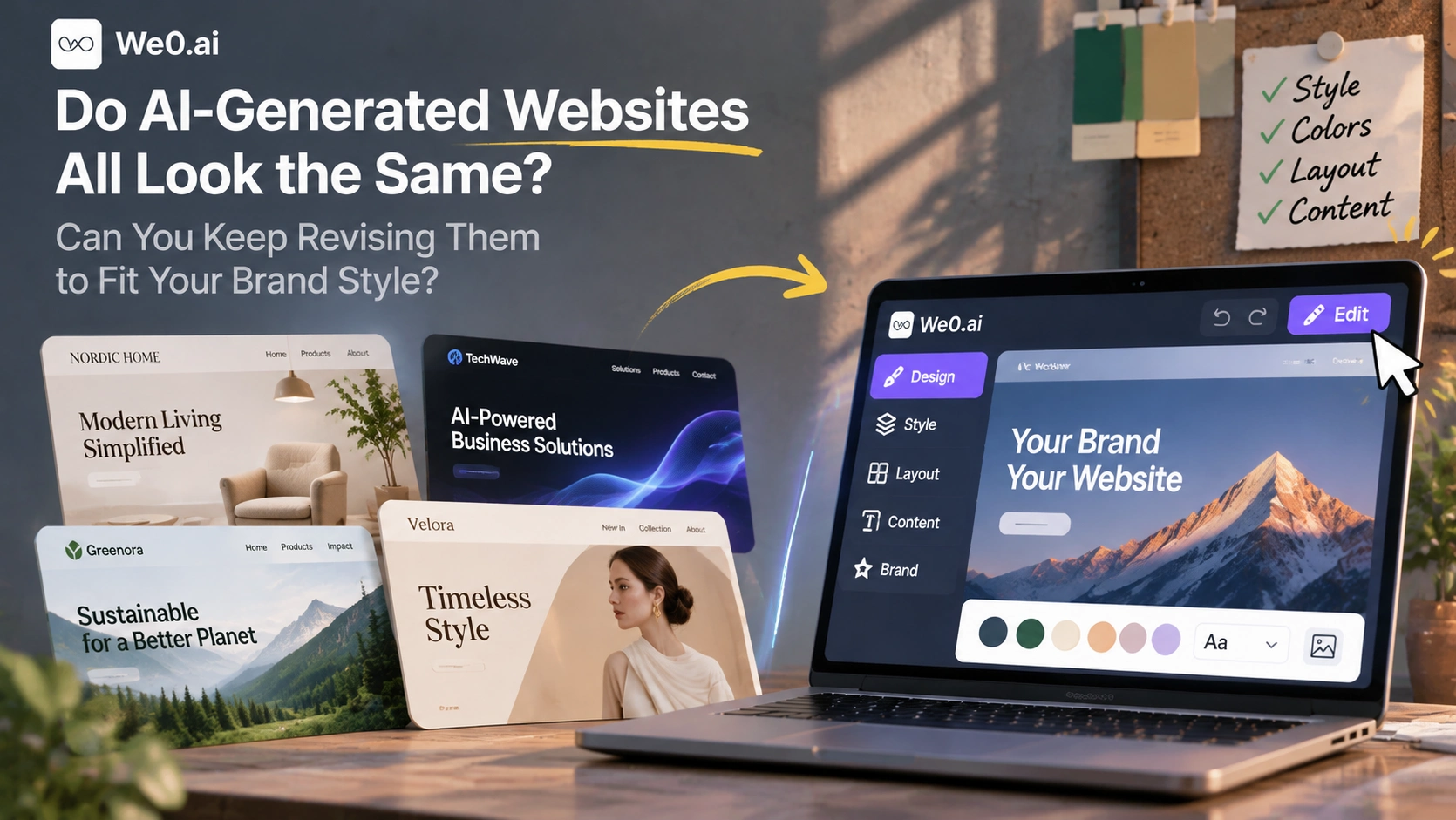
First, AI-generated websites do show obvious homogeneity: many tools by default follow a 'template library + one-shot generation' path, and when the same requirement is put into different tools, the layout rhythm, whitespace ratio, and section order are often highly similar. Second, similarity is not inevitable. When a tool has an independent style layer, an editable design canvas, and element-level and multi-select editing capabilities, the same requirement can produce very different pages, and they can be adjusted repeatedly after launch without being torn down and rebuilt.
In other words, 'AI-made websites all look the same' describes the default way most tools work, not the ceiling of AI website building. What really determines the final result is how deeply you can intervene after generation. The next thing to judge is whether your team needs 'a presentable page launched in three minutes' or 'an official website that carries the brand and must be iterated over the long term.' These two things have completely different requirements for tools.
Why do many AI-generated websites look very similar
Similarity comes from four specific mechanisms, not a vague explanation such as 'AI has bad taste.'
- Template libraries set the ceiling. The generation of many tools is essentially 'pick a preset template, then replace the copy and images.' The available structures are limited, and style variation can only stay at this layer.
- Prompts do not carry enough information. If you only write 'help me make a company website,' AI can only apply the default aesthetic average: a centered large headline, three-column features, gray-white colors, and card-based cases.
- Generation is one-shot, and edits are page-wide. Changing one sentence of copy carries the risk of reflowing the whole page. Users often end up not changing it at all, and homogeneity is preserved.
- The content itself is repetitive. Placeholder copy, generic stock images, and a lack of brand-specific cases and data make sites read like the same batch even when the structure differs.
Cross-sectional reviews show the direct consequences of this mechanism. A 2026 AI website builder review, when testing local service sites, pointed out that test sites generated by Durable 'all look like they come from the same template family, just with different colors,' and positioned it as a transition option for fast launch rather than a long-term platform (Nubia Magazine review).
The implication for businesses is direct: the cost of homogeneity is not at the moment of building the site, but in brand recognition and conversion afterward. An official website that does not show industry attributes or brand personality is hard for visitors to remember, and even harder to be cited by AI search as a representative answer in a field.
Can AI choose different design styles based on brand positioning
Yes, but you need to distinguish two kinds of 'style.'
One is just reskinning: change the primary color, change a background image, change a set of default fonts. There is a visual difference, but structurally it is still the same template, and visitors can feel familiarity after scrolling two screens.
The other is structural-level difference: the hero format, the choice and order of sections, the presentation of cases and testimonials, whitespace density, and the closing method all change with brand tone. A brand website cares more about company background and trust building; a marketing page emphasizes focused selling points and a conversion path; a portfolio values visual rhythm and project ordering. The difference must happen at the structure and content organization layer to count as a real style distinction.
The judgment standard is therefore simple: if a tool's 'style' appears only in colors and fonts, it is still giving you a template; if it can change section combinations and content rhythm, you have a chance to make a page that does not look like a template.
Colors, fonts, layout, page structure: to which layer can you specify

Customization granularity is roughly divided into four layers; the deeper you go, the closer you get to actually doing design.
| Layer | How to describe it to AI | Typical failure of doing only half a layer |
|---|---|---|
| Visual layer | Primary color, secondary color, neutral color, accent color and usage ratios; font family and type scale; corner radius and shadows | Changing only the primary color without changing hierarchy is just a skin change |
| Typography layer | Grid columns, container width, section spacing, whitespace density, text-image ratio | Changing only colors without changing whitespace leaves the page crowded |
| Structural layer | Page list, section order on each page, sections to explicitly avoid | Without a defined list, extra pages are generated or pages are missing |
| Semantic layer | Target customers, core selling points, facts that must appear, and FAQs | The copy is all adjectives and lacks citable information |
Most complaints that 'AI websites all look the same' are actually stuck at the third layer: users only give first-layer instructions, and tools only open first-layer edits. Raise the description to the structural and semantic layers, and the output difference will immediately become larger. For example, for a finance and tax SaaS aimed at small and medium-sized businesses, you can prompt like this: dark ink green as the primary color with a warm white background and a single high-brightness accent color, no gradients; content area width controlled, section spacing on the larger side, cards no more than two columns; the homepage is fixed as hero + customer pain points + three capabilities + two cases + pricing + FAQ + closing CTA, no carousel; the copy must include the company entity, implementation cycle range, and five FAQs. This passage costs very little, yet it determines whether AI is filling in a template or organizing a page.
If I only want to change one module, do I need to regenerate the whole page?
It depends on whether the tool provides element-level editing. The ideal state is to change it yourself: change one headline, replace one image, adjust one paragraph of description, and only that place moves while the rest of the layout stays unchanged. This kind of interaction is a basic capability in design tools, but in AI website builders it is a key dividing line: tools that support element-level editing turn changes into a matter of seconds, while tools that do not require regenerating the whole page every time and accepting uncontrollable reflow.
When batch adjustments are needed, the gap is even more obvious: unify button copy across the site, lower all card headline font sizes by one step, unify case image ratios, replace a certain type of accent color globally. The value of multi-select editing is not speed, but consistency: changing items one by one is easy to miss and easy to cause style drift; after multi-selecting and submitting one unified change, similar elements change together. There are two things to note when using it: before batch editing, confirm that element types are consistent—one button and one text link usually differ in style, and mixed selection will deform the result; after batch editing, spot-check non-target sections, because a unified font-size adjustment may cause line-break misalignment in a dense section.
Operationally, judge in this order:
- First distinguish whether the change is content-level (copy, images, links) or structural-level (adding sections, changing layout).
- Content-level changes go through element-level editing and should not trigger regeneration.
- Structural-level changes are made by adjusting sections on the canvas, or by targeted redoing of a single section, rather than redoing the whole page.
- Only when the overall style needs a new direction is it worth regenerating the whole page.
How to check desktop and mobile effects separately

Build a showcase site and grow leads in minutes
Describe your idea once, and We0 AI can generate a showcase site, pages, and CMS, then help you attract customers and traffic after launch.
One complete project generation for free registration
Best for trying one complete generation flow and seeing a first project draft quickly.
Typography that looks restrained on desktop often becomes a hero that takes two screens to finish on mobile. It is recommended to fix the checking order:
- First look at the overall rhythm on desktop: whether the hero information is fully communicated within the hero, and whether whitespace between sections is even.
- Then switch to mobile: whether the hero is squeezed, whether buttons are easy to tap, and whether tables and code blocks overflow horizontally.
- Confirm breakpoint behavior page by page: whether card columns drop to a single column as expected, and whether navigation collapses into a menu.
- Check long text and mixed Chinese-English typesetting: whether the type scale breaks, and whether line height is compressed.
- Recheck on real devices, at least one iOS and one Android device, not just simulators.
Test case: the same requirement, three brand styles
Fix the same content draft—a finance and tax SaaS official website for small and medium-sized businesses, with the same page list (homepage, product capabilities, cases, pricing, FAQ, contact)—and change only the style instructions to generate three versions.
- Tech brand style: dark background with monochrome highlights; the hero uses a capability-oriented claim; the product capability section is arranged in three columns; cases are presented as data metric cards.
- Minimal business style: warm white background with dark ink green; the hero keeps only one value proposition and one CTA; section spacing is noticeably increased; cases change to two-column text and images; decorative graphics are removed.
- Creative design style: asymmetric grid; headline font-size range is larger; cases change to a large-image waterfall layout; FAQ uses two-column accordions.
The biggest difference is not color, but hero information density, section order, and whitespace ratio. When these three change, the same content reads as three brands.
Then do a local modification comparison: before the change, the hero subtitle was a three-line industry description, and on mobile users had to scroll two screens to see the CTA; after the change, the subtitle was compressed into a one-sentence description of just over ten words, and the CTA was moved below the hero, while the other sections stayed unchanged. The result is complete hero information without triggering a full-page reflow—this is exactly the difference between element-level editing and full-page regeneration.
Cross-sectional testing from a designer's perspective also confirms that the gap mainly comes from whether the site can be changed after generation. When the same requirement was given to Squarespace Blueprint AI, Wix AI, Lovable, Webflow AI, and Framer AI for generation, design item scores ranged from 1/5 for Framer to 4/5 for Wix and Webflow; Webflow's output was considered the best designed, but the editor users then enter would deter most business owners (Design by Ency test).
Purchase and acceptance checklist: judging whether an AI website builder can be changed
Use the following checklist during the trial phase; it is much more reliable than watching demo videos.
| Check item | Specific question | Pass standard |
|---|---|---|
| Generation method | Template replacement or section composition | Can specify page list and section order |
| Style control | Can you specify colors, fonts, grid, whitespace | Can produce structural-level differences, not just reskinning |
| Local editing | Does changing one piece of copy trigger full-page regeneration | Element-level editing, with the rest of the layout unchanged |
| Batch editing | Can multiple elements be selected and adjusted together | Supports multi-select and maintains visual consistency |
| Multi-device acceptance | Can you switch device views for checking | Desktop, tablet, and mobile can be checked separately |
| Iteration continuity | Is the original design preserved after changes | The baseline can continue and can be rolled back |
| Launch and operations | Does it support domain deployment, content management, and SEO/GEO basics | Content can be continuously updated after launch |
If two or more of the first five items fail, the tool is more suitable for temporary pages than for a long-term official website that carries the brand. After choosing a tool, three more things need to be added: write 'can it be changed' into the selection criteria, not just generation speed; organize brand guidelines into a reusable constraint list (primary color and usage ratio, type scale, corner radius and shadow rules, hero information limit, image style, prohibited elements), and give it to AI together with the requirement each time, so style drift will be significantly reduced; establish a content draft—company entity information, service scope, case data, and FAQs—which serve both visitors and AI search citations.
How we0 supports this 'editable' chain
Generation is not the endpoint. In the three-step process—describe the requirement, multi-Agent real-time building, adjust in the visual canvas and publish to your own domain—adjustment is a default step, not a remedy. Multi-style design turns sections such as hero, advantages, introduction, features, cases, pricing, FAQ, and CTA into a composable page system, with style differences reflected in section selection and page rhythm; the editable design canvas supports element-level editing of text and images, multi-select editing, and switching between device views, so local adjustments do not require redoing the whole page (capability description: we0 official website).
It should be noted that these capabilities solve the efficiency problem of customizability and iterability; they do not promise rankings, traffic, or deal outcomes—those depend on content quality, industry competition, and operational investment.
FAQ
Do AI-generated websites all look the same?
The default output of most tools is indeed similar because they follow a template-library plus one-shot generation path. When a tool supports section composition, style parameters, and element-level editing, the same requirement can produce noticeably different results.
Can I specify colors, fonts, and layout?
Yes, but describe them by layer: colors and type scale at the visual layer, grid and whitespace at the typography layer, page list and section order at the structural layer. If you only give visual-layer instructions, the output usually still looks like a template.
If I only want to change one module, do I need to regenerate the entire page?
No, provided the tool has element-level editing capabilities. Text and image elements can be edited directly on the canvas without affecting the rest of the layout; only a complete style change requires regeneration.
How do I confirm the mobile effect?
Check in a fixed order: desktop hero and section rhythm, mobile hero information volume, breakpoint behavior (card columns, navigation collapse), mixed Chinese-English typesetting and long text, and finally recheck on real devices.
Related Tools
- We0: an AI intelligent website building and lead growth workspace, covering natural language website building, editable design canvas, content management, and SEO/GEO optimization.
- Squarespace Blueprint AI, Wix AI, Framer AI, Webflow AI: mainstream AI website builders that appeared in this comparison, which can be used to verify style controllability.
Related Links
- we0 official website
- Top 10 Best AI Website Builders In The World 2026 · Nubia Magazine
- Best AI Website Builders 2026: 5 Tested by a Designer · Design by Ency
Summary
AI-generated websites look similar because template libraries set the structural ceiling, prompts do not carry enough information, one-shot generation cannot be edited locally, and content assets are repetitive—not because of the ceiling of AI capability. Move brand requirements from colors and fonts to section order, page lists, and a citable information layer, and the same content can read as three styles; changing one module does not require regenerating the whole page if the tool has element-level editing; changing multiple places depends on multi-select editing for consistency; desktop and mobile must be accepted separately. we0 uses a composable multi-style page system and an editable design canvas to support the adjustment stage after generation, allowing the official website to iterate continuously while retaining the original design.